 Starbucks
 Usually when Starbucks starts using their red holiday cups to serve out your venti, low-fat, no-foam, half-caf skinny Peppermint Mocha latte, it's a cause for celebration! ‘Tis the season for merriment and Christmas cheer! Right?
For some Starbucks consumers…wrong. Dead wrong.
This year, many customers are not at all happy with the design of Starbucks' red cups. For the 2015 holiday season, Starbucks went with a minimalist, ombré effect for their seasonal drinks, and a lot of people are upset because the Christmas-esque décor is gone. Of course, we're just happy to see the red cups at all because that means we are that much closer to getting presents (and that much closer to the release of Star Wars: The Force Awakens!).
Anyway, we thought it might be nice to press "pause" on all the controversy for a moment and instead take a look back at how Starbucks' iconic red holiday cup has changed over the past 10 years. Starbucks has been putting out red cups to celebrate the merriment of the holiday season since 1997, which is probably long before many of you took up a caffeine addition.
Winking snowmen, quotes, ornaments and more festive trimmings adorned the Starbucks cups in years past, which makes 2015's simple design all the more dramatic. Take a look at the evolution of the red holiday cup over the past decade:
2005:
This cup had a cute little string of lights and a very clear statement of fact. How very Dwight Schrute of Starbucks.
2006:
2006's design featured silhouettes of holiday shoppers and ice skaters along the bottom. Even the coffee sleeve was festive!
2007:
"Pass the cheer" was the theme in 2007, and we are lovin' how the shade of blue pops against the cheery, cherry red.
2008:
Snowflakes! Deers! The Starbucks logo as a giant ornament! This one screamed "Happy Holidays!"
2009:
This one looks like Starbucks Googled "holiday buzzwords" and threw them onto the cup. We're into it.
2010:
2010 was the start of the era we like to call "The Creepy Characters." The carolers didn't have faces!
2011:
Here's a creepy winking snowman.
2012:
Here's an even bigger, creepier winking snowman! (We kid because we love, you guys).
2013:
Goodbye creepy characters, hello giant ornaments!
2014:
When you look at 2013 and 2014, you can kind of understand how Starbucks evolved to a cleaner design for 2015, no?
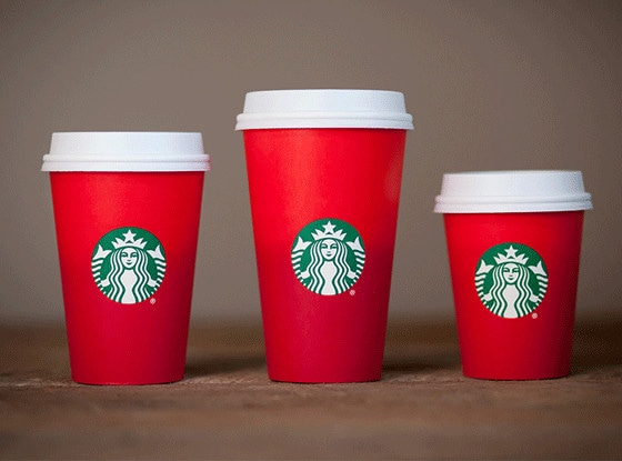
2015:
Finally, we get to the new cups. Simple, sleek and so trendy. We happen to love them, but maybe that's because we can't resist a bad boy. And the 2015 Starbucks red cup is definitely the "bad boy" of the coffee world.
What do you think of this year's red cup design? Do you prefer it to the previous years, or do you think they should revisit some of the older themes?
Speaking of the Christmas season, check out how Chris Pratt celebrates this time of year with his adorable family: